

In the world of advertising, few mediums are as unforgiving as the billboard. With just a few seconds to grab attention—often while viewers are hurtling past at 60 miles per hour—billboard design has to be punchy, precise, and perfectly planned. There’s no scroll button, no audio, and no chance to replay. You get one shot. And if your message doesn’t land instantly, it’s lost in the blur of traffic.
Welcome to the art of designing for the drive-by—a high-stakes blend of graphic design, psychology, and marketing strategy. While digital and social media ads offer room for nuance and storytelling, billboards demand clarity and confidence. So, what makes a billboard successful? The answer lies in a handful of visual rules that separate forgettable signs from unforgettable ones.
Rule #1: Keep It Short (Really Short)
Let’s start with the golden rule: brevity is everything. The average driver has about 5 to 7 seconds to see and process a billboard. That’s barely enough time to read a sentence—let alone understand a paragraph.
The industry standard? No more than 7 words, and ideally fewer. Think of your billboard as a visual headline. It should say just enough to spark interest or plant a brand name in someone’s mind.
Nike doesn’t need a monologue. “Just Do It” is enough. McDonald’s? A logo and maybe “I’m Lovin’ It.” If you need to explain the message, the billboard isn’t working.
Rule #2: One Message, One Focus
A common mistake in billboard design is trying to cram too much into the limited space. Phone number, website, special offer, address, slogan, product shot—it’s tempting to include it all. But when everything is emphasized, nothing is.
A successful billboard has one clear message. Are you building brand awareness? Driving people to a website? Promoting an event? Choose a single goal and let everything else support it.
If someone remembers your name or offer after speeding by at 70 mph, you’ve won.
Rule #3: Bold Typography Is Non-Negotiable
Billboards are not the place for subtlety. Fonts need to be bold, large, and readable from a distance—not just across the room, but across lanes of traffic.
Sans-serif fonts like Helvetica, Futura, or Impact are common favorites. They’re clean, modern, and easy to read. Script fonts or decorative lettering, on the other hand, may look stylish on a screen but turn into unreadable blobs from the road.
Designers also need to pay attention to kerning (spacing between letters) and contrast. White text on a dark background (or vice versa) typically offers the best visibility. Avoid putting text over busy images or patterns.
Rule #4: High-Impact Imagery Wins
The best billboards often rely on one striking visual—a powerful image that reinforces the message. Think of Apple’s iPod silhouettes, or a close-up of a steaming cup of coffee for a local café.
The key is simplicity and recognizability. Complex scenes or cluttered graphics don’t translate well when viewed at high speed. Instead, use bold shapes, clear icons, or strong photography that can be interpreted at a glance.
And remember: a good image should support the text, not compete with it.
Rule #5: Consistent Branding Is Crucial
Whether the goal is immediate action or long-term brand recognition, your visual identity needs to shine through. That means using your brand’s colors, fonts, logo, and tone of voice consistently.
Many successful brands treat billboards as extensions of their broader marketing campaigns. The messaging, visuals, and feel align with what people see online, on TV, or in print. This cohesion helps build brand recall over time.
Think of how recognizable Coca-Cola’s red background or McDonald’s golden arches are—no explanation needed. That’s the power of branding done right.
Rule #6: Location Shapes Design
Where a billboard is placed should influence its design. A rural highway, for instance, offers more uninterrupted time to view a sign than a busy city street. In contrast, an urban setting might involve stop-and-go traffic or pedestrian viewers.
Readability distance also matters. A board meant to be viewed from 500 feet away needs larger type and simpler design than one on a street corner. And if your billboard is among several others in a dense cluster, your design must fight harder to stand out—through color contrast, movement (if digital), or clever visuals.
Understanding the context isn’t optional—it’s essential.
Rule #7: Humor and Surprise Stick
Billboards that make people smile—or better yet, do a double-take—tend to stick in their minds. Humor, clever wordplay, or visual puns can be incredibly effective if done well.
Take Chick-fil-A’s “Eat Mor Chikin” campaign, where cows hold misspelled protest signs. It’s simple, funny, and instantly memorable. Or consider billboards that interact with their environment—like a makeup ad where the model “blows away” falling leaves using fans built into the sign.
These creative touches not only capture attention but create conversation, often making their way onto social media for added reach.
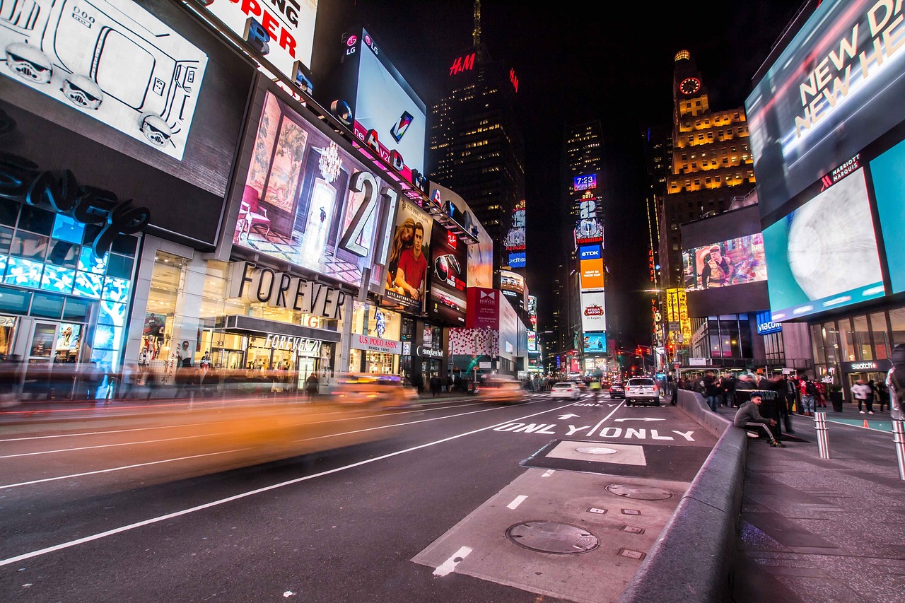
Rule #8: Digital Billboards Call for Motion and Timing
Digital billboards are becoming more common—and bring their own design considerations. Motion should be subtle and purposeful, not distracting or overwhelming. Think of light animations, moving text, or dayparted content that changes throughout the day.
Digital also allows for real-time relevance: weather-based ads, countdowns, sports scores, or even localized messaging. But timing is critical—if a driver only sees the board for 5 seconds, don’t rotate your content every 10.
Treat digital billboards like loops with punchy frames, not full-blown video presentations.
Final Thoughts: Simple, Smart, and Strategic
At its core, a successful billboard is visual communication distilled to its purest form. It’s not about complexity—it’s about clarity. It’s not about shouting the loudest—it’s about saying the right thing, the right way, at the right time.
Designers who succeed in this space think like drivers. They prioritize readability, brevity, and impact. They resist the urge to over-design, and instead focus on delivering one unforgettable moment in motion.
In the fast-paced world of outdoor advertising, you don’t have minutes to tell your story. You have seconds. And when you design for the drive-by, every second counts.